Implement a Layout with Fractional Units
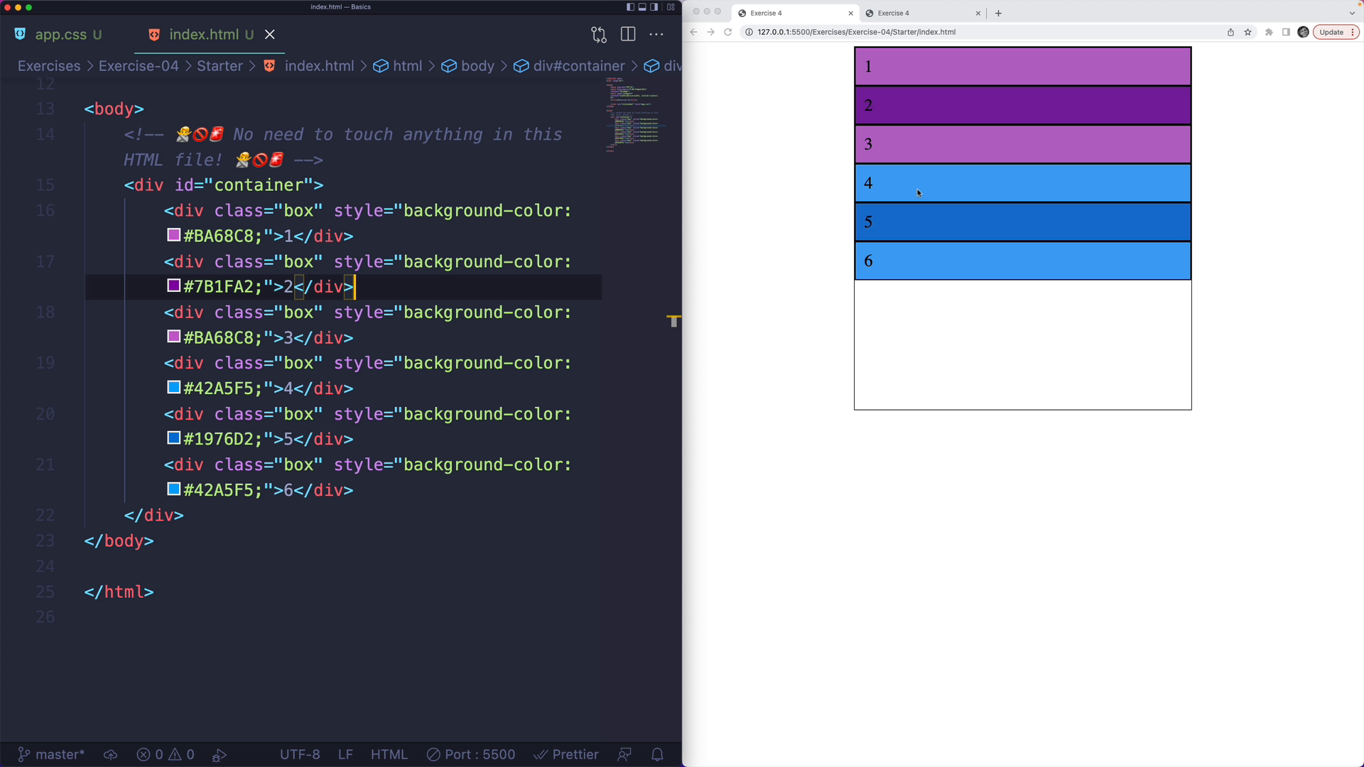
In this exercise, you are given six boxes inside a container:

Challenge
Your task is to up
Transcript
0:00 It's time for another exercise. This time I'm providing you with another set of boxes in a container. Some are purple, some are blue. The color doesn't really matter. We have six boxes in a container. You don't need to touch the HTML file. What I'd like you to do is generate this layout.
0:16 Now, this layout is a three-column layout where each column is exactly the same size. Then we have a two-row layout where the top row is twice as large as the bottom row. There's no pixels involved here. You could call it responsive. As you can see, the columns will grow as will the rows grow and shrink.
0:37 This row is always half the size as this row. Then this column is always the same size as this one and this one. What I'd like you to do is write the CSS to make that work. As always, ignore the no-touching zone. You don't need to touch any of that. Write your code down here to style the grid container.